As the UK wine industry continues to grow, not only will new brands start hitting the shelves at an exponential rate, but, in a bid to accurately reflect the quality and reputation of the nation’s wine, established brands will continue to invest in raising the bar in terms of image and design.
In the past few months, the market has witnessed the unveiling of new label designs from two of England’s leading sparkling wine producers, highlighting that regardless of whether you are a new or existing producer now is the time to make sure that your products stand out.
Not all designers are created equal so Vineyard Magazine caught up with Will Parr, creative director of branding and packaging specialists Studio Parr, to find out how estates can utilise design to reflect their story and ethos and, most importantly, to avoid getting left on the shelf.
How often should producers update their labels?
WP: It’s tricky because nowadays it is not about just looking at the label design. Producers are investing more, standing back and looking at the bottle as one piece, admittedly a very important piece, of the entire brand. The industry has entered an era of developing brands, not just labels and, done right, a producer’s branding should have the ability to stand the test of time.
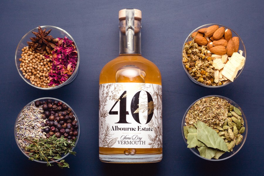
From there, the label design will be able to evolve and can be altered to keep up with the times. But there is no set timeframe for updates and sometimes you have to judge what the consumers want. With Albourne Estate, for instance, the initial concept was to choose a different artist each year, but the first set of labels became so iconic, they decided to keep them.
What are the benefits of using a designer with wine label knowledge?
WP: It is too easy to appoint the same person who designed the website or a graphic designer who does a bit of everything, but it is likely they will be limited to following the design characteristics of already established producers. Equally, you could go to a brand specialist in another industry, such as fashion, to get something radically different but they are not always able to transfer their ideas to a bottle. Particularly with sparkling wines, as it becomes harder to integrate all the elements, such as the cage, foil and label into one design. All of the well-known producers with smart and considered labels have invested in branding and packaging specialists and have taken a more holistic approach.
Should the industry try to create a quintessentially English or Welsh style of label?
WP: Historically, English sparkling wine producers and designers were simply looking to the Champagne region to copy their pattern. A few brands around the same time, such as Hoffmann and Rathbone, Nyetimber and Wiston Estate, broke those shackles and took what people expect from a sparkling wine and reinvented it. Done well it is about interpreting what has been done in the past, finding what makes sparkling wine feel special and indulgent, and making that unique to the producer.
We don’t need to try and recreate labels which look like other regions to highlight the quality. The beauty of the UK wine market is that because it is young, we don’t have any set design preconceptions or rules and we can do our own thing. A few people are striving to create a look and feel which is typically English, or Welsh, but I wouldn’t recommend that because the vibrancy of the industry allows us to work on designs without constraints. It is a vibe you wouldn’t find in Europe and that is one of our biggest selling points.
What should you expect from a well-designed label?
WP: The best labels appear when the brand story and the products have been thought about at the same time. Not everything has to say the same message and your bottle of wine shouldn’t have to tell the consumer everything about the producer. You want to ensure that the consumer is intrigued enough to seek out more information, either from the website or from visiting the vineyard. By looking at the brand elements as a whole, you can break down the story into different layers and let the consumer discover it for themselves.
How can design reflect the reputation of English
and Welsh wine?
WP: I have been working in the industry for around 12 years and the market has already changed massively. The era of the farm shop, very basic looking labels is not there anymore. The reputation of wines and what is expected is different. You can’t charge £15 for a bottle of still wine without the design looking as if it has been properly considered and with a tactility to the label which reinsures its quality.
What are the biggest mistakes when it comes to label design?
WP: One of the most disheartening situations is when a producer has spent all their money, time and effort getting their wines off the ground only to fall at the last hurdle. Very few realise the importance of spending just that little bit extra to get that bottle label right. Producers need to budget, because it doesn’t cost much to get a really good-looking label; you don’t have to go to a big London firm, there are other options.
Should producers be afraid of a complete redesign?
WP: A good agency will treat an existing brand with respect and if producers are concerned then there is the option to look at several concepts ranging from evolutionary and revolutionary. Somewhere in the middle you will find a design which has familiar elements and instils confidence.
Can producers expect design agencies to talk to the printers?
WP: There is no point investing in an agency to design a label if it is then not printed properly. The closer the relationship between the designer and the printer the better the final results will be. That relationship combined with technical knowledge means we push the printer to do things which are a bit more complex and we can make decisions on details like gold foil and detailed embossing.


