In terms of labelling and packaging has everything been too safe, too pastoral, too classic?
Before I launch into my topic, an admission: I’ve spent the past three decades working in beers, wines and spirits. Not just wines, not just English and Welsh wines, but across a whole range of alcohol categories. I’ve done the tastings, I’ve toured the vineyards (first one was Denbies) but I’ve spent as much time in Speyside and far-flung craft breweries, as I have in Kent and Sussex. This means I still look at our wines like an outsider. I can still remember when I first drank Bacchus; back then I never expected the decades of explosive innovation and growth which we now see – only two weeks ago I drove past Sheveling Wine Estate in Southern Yorkshire. I’m still waiting for an ice wine from Scotland though!
There has been liquid innovation, drinker education and many success stories across the whole sector. But in terms of labelling and packaging has everything been too safe, too pastoral, too classic? Have our wines become much of a muchness drawing on traditional wine language, have any boundaries been broken, and are we still a long way from witnessing the development of an English wine language per se?
A quick tour round the Hawkins Bros website, specialist English wine merchants, gives one a great overview of what is available in 2022. It’s a good place to start when analysing labelling and packaging of English wines. My initial thoughts that national producers have ‘safe’ designs is borne out based on a cursory glance. But it makes sense to look at those producers who are investing in design and developing their own visual language.
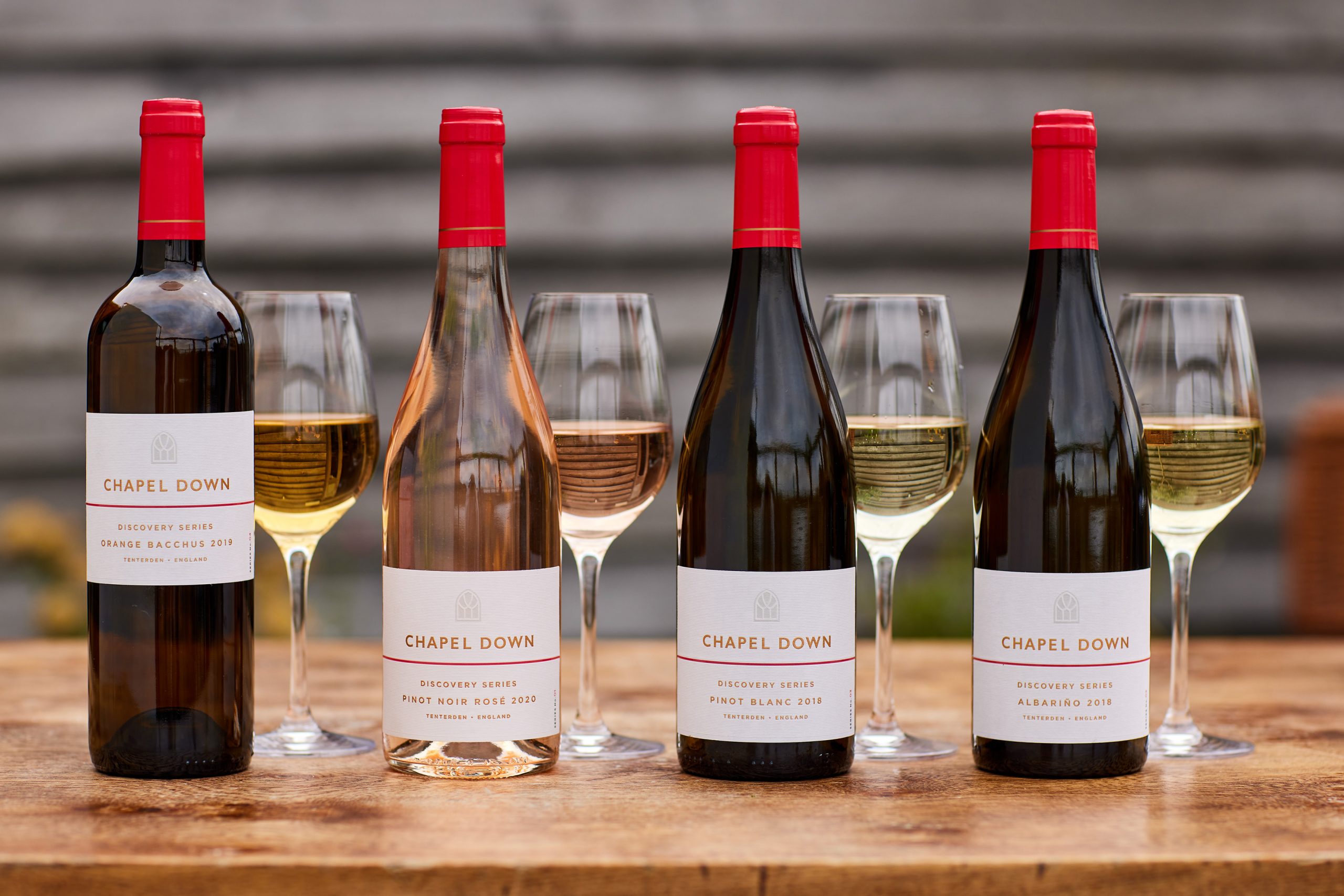
My first port of call has to be Chapel Down which has a history of winning awards for its branding and packaging. I’m particularly impressed by the Discovery Series designed by Denomination. There are an initial four still wines: a Pinot Noir Rosé, a Pinot Blanc, an Orange Bacchus and an Albariño. Part of a five-year innovation project from Chapel Down’s head winemaker, Josh Donaghay-Spire, the Discovery Series seeks to showcase the versatility of grape varieties and winemaking practices in England, rivalling those of its international counterparts.
This is an excellent example of new varietals being introduced to an English wine brand. What is required of the label is reassurance of quality, and I would argue that the design should be ultra premium given the intended drinker profile. The labels are the epitome of elegance and refinement, giving a strong impression of high quality wine which allows the person meeting these varietals on UK soil, perhaps for the first time, to have confidence in the range. The restrained, pared back labels definitely prove the design adage that ‘less is more’. Pioneering wines with an overly contemporary or outlandish look often fail. My view is that a great label should make you want to open the bottle and drink – the labels of Chapel Down Discovery Series have me reaching for the corkscrew.
Regional differences in wine label design
If one looks at France or Italy (not just in sparkling), there is a clear difference region by region in the wine language, and this can often be seen at appellation level. My sense was that this doesn’t happen on these shores. Reviewing English & Welsh wines and making a comparison county by county it’s honestly quite difficult to see the difference between Cornwall and Kent. As someone who has visited many corners of each county, the topography and landscape of each county could not be more different – yet label designs are surprisingly similar. I do think there is a real opportunity now that the homegrown industry is maturing for more regionality to be incorporated into the brand expressions developed in each county.
Even the gift boxes which could be a celebration of our unparalleled countryside tend to be drab affairs with a nod to Champagne design conventions, and not a hint of Englishness.
Notwithstanding I think true originality in brand design and pack format is beginning to emerge based on unbridled creativity and use of colour. For me there are two stand outs which are forging their own path in terms of design and packaging. The first is Harlot, made in the Charmat method, which totally subverts the Prosecco language, and provides a whole new take on English wine. This is the kind of brand which could bring a whole new set of drinkers into the category.
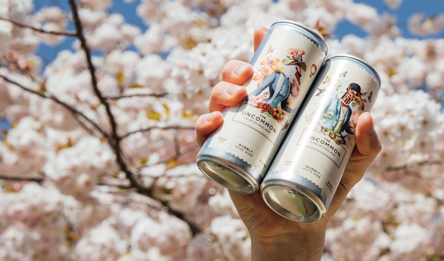
Second is The Uncommon which I first came across on the now defunct Farmdrop website. I have always championed single-serve formats, and I have a particular affinity with the can having worked on the commercial strategy for the wine can format many moons ago. But The Uncommon has taken the format to a whole new level in terms of impact and imagery. It is totally recognisable on the shelf and indeed in any context; the brand is continuing to evolve in the most imaginative way. Even the carry pack is sophisticated … and cool, not stuffy.
Format is beginning to evolve in even more unexpected ways as circular economy supply models emerge in the UK wine scene. I’m particularly impressed by Sustainable Wine Solutions (Borough Wines as was) and everything they have to offer. They are certainly setting the bar very high when it comes to reuse and “non-bottle” solutions. VinoTap™ breaks the mould, and is something I believe we will see more of as both legislation and consumer behaviour evolve.
My feeling is that there is more to come from English and Welsh wines in terms of labelling, packaging and delivery. Firstly we should cast our minds forward and define what the innovation spectrum for English and Welsh wines should be. English and Welsh wines can’t be too far ahead of the curve, nor can they afford to be too far behind. The biggest new trend is No/Lo and mindful drinks – how on earth does English and Welsh wine fit in? I’m really not sure that fine estate-bottled wines should take that route. But I would be delighted to be proved wrong.
Should English and Welsh wines sidestep that trend and look to ride the next one – what should happen next? There is so much potential in our fine and undervalued origin. It is time to step up and change gears.
Without doubt the biggest story of this decade will be sustainability and net zero – that is where English and Welsh wines can win and will win hands down. But what does that mean in reality? Isn’t every wine brand all natural and ‘giving back to nature already?’ Well no. Net Zero is a competitive advantage, and it’s measurable. It can be achieved on so many levels. And then there’s biodiversity and how local viticulture that can have an overwhelmingly positive effect on natural capital.
It’s worth noting that twelve producers received Sustainable Wines of Great Britain (SWGB) certification in summer 2020. This is a tremendous achievement. Additionally there is the influence of The Sustainable Wine Roundtable, based in London. Their mission is to make sustainability mainstream in the wine industry – not restricted to England, but many of the members are based here.
But do British brand owners truly reflect their values in their label designs and packaging?
On the whole I would say that vineyards and brand owners are failing to reflect their uniqueness and viticultural heritage in the way they present themselves to the drinking public and trade. There is plenty of beautiful photography on websites, but this is not translating to the copywriting and imagery on the bottled product. Copywriting on wine labels is as important as any visual element, and I don’t see genuine differentiation from brand to brand. If we look at nascent brands in the UK food industry, they are firing on all cylinders when it comes to emotive copy.
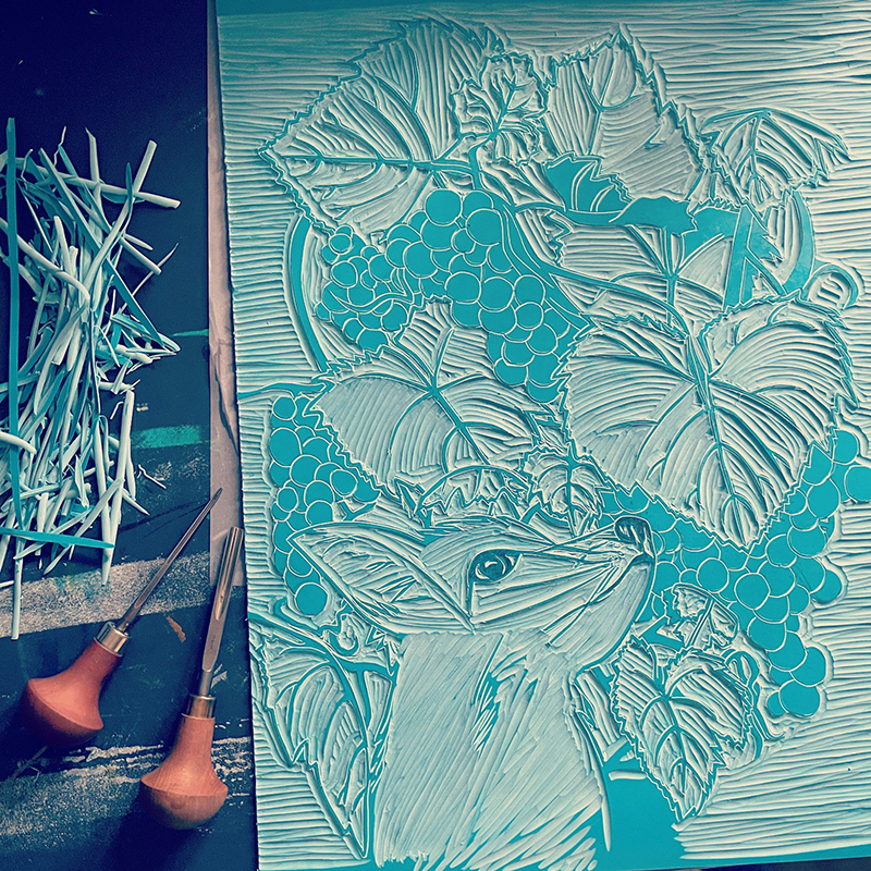
In contrast to the above, it would be appropriate to single out Kent vineyard and red specialist, Redhill Farm Estate who are working on a new range which supports Kent-based charities with an affinity to the vineyard. Owner, Henry Boorman, is of the firm belief that sustainability should not just be focused on carbon footprint and the climate crisis. This new range supports a whole range of sustainability causes. He is acutely aware of the extensive commitments required by the 17 Sustainable Development Goals (SDGs) and wanted to reflect that in this range.
The label illustrations are being created by local artist Katie Thomas-Mitson and feature aspects of local nature such as a butterfly, a fox and a pheasant living on the vineyard. Each wine supports a local charity focusing on a different issue.
This is most definitely the decade of giving back to nature. The brand which does the most, and communicates that the best, will perform strongest. The English wine industry can bring millions of drinkers into the category who are desperate to do the right thing, and they will no doubt adore English and Welsh wines and pass their love of these wines on to a whole new generation of planetary protectors.
It’s time to say goodbye to 19th century wine label norms and for the wines of this island to create a dynamic visual language which draws on the beauty of our counties, beloved by visitors all around the world. Every bottle can sing, every word can count, and brands can capture the beauty of their origin which catapults English and Welsh wine to where it deserves to be.