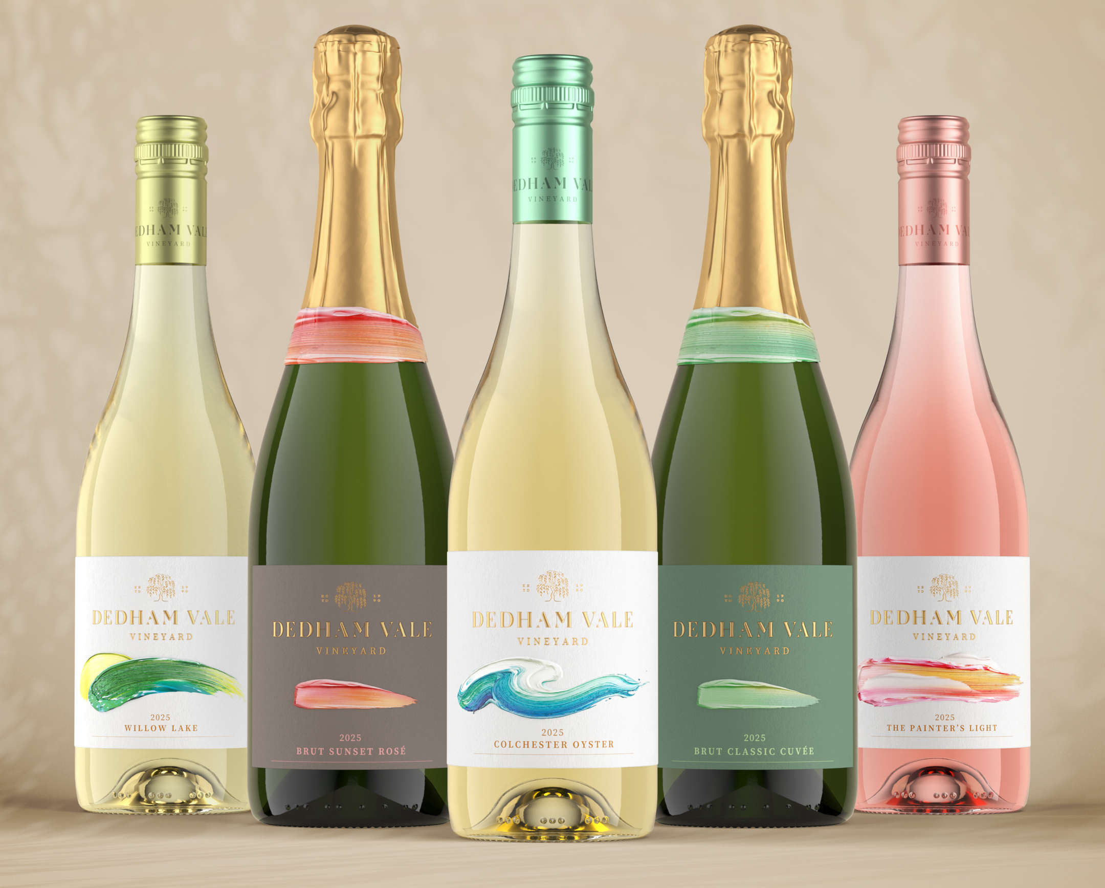

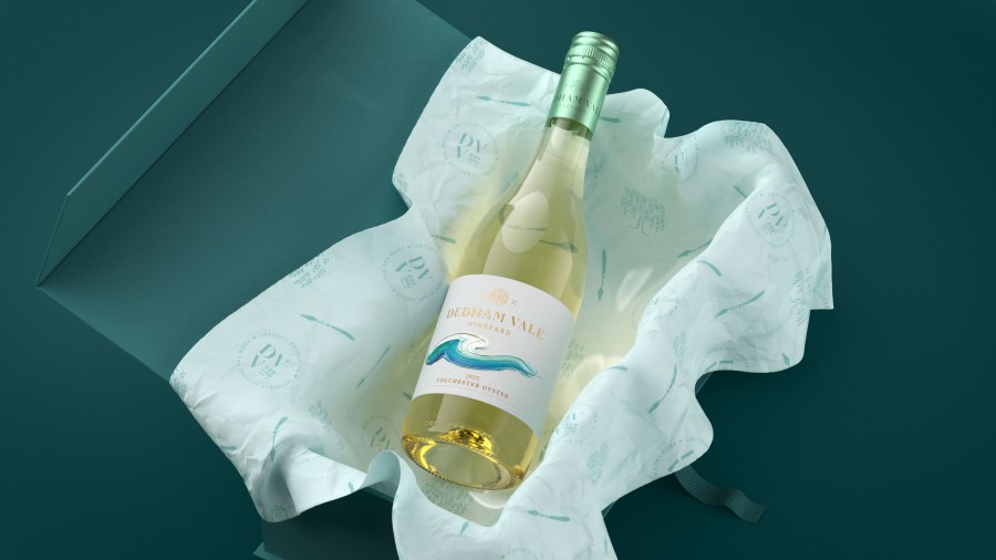
As English wine moves from emerging category to established premium player, brand strategy and design agency Contrast has unveiled a new identity for Dedham Vale, creating a distinctive positioning rooted in the landscape that inspired some of John Constable’s most celebrated works.
Acquired by new owners last year, the established Essex vineyard recognised an opportunity to redefine its brand as the English wine category continues to evolve. Contrast was appointed to develop a strategic positioning and visual identity that would better reflect the quality of its wines while differentiating the business in an increasingly competitive market. The rebrand forms part of the vineyard’s long-term growth ambitions, providing a platform for an expanding portfolio, new audiences and future innovation.
Research into the English wine market revealed a category often divided between heritage-led wineries steeped in traditional British symbolism and smaller challenger brands embracing a more disruptive, craft aesthetic. At the same time, younger consumers are increasingly discovering English wine through wine tourism, countryside escapes and premium hospitality experiences, creating an opportunity for Dedham Vale to occupy a distinctive middle ground – celebrating its heritage through a contemporary lens.
The strategic positioning informed every aspect of the redesign. The vineyard has been renamed simply Dedham Vale, creating a broader platform that can evolve alongside the business as it grows. At the heart of the identity sits a new willow tree marque inspired by a central, historic willow overlooking the vineyard’s lake, while the wider visual identity draws on the changing skies, natural textures and the light that define the landscape. Inspired by Constable’s fascination with the skies above Dedham Vale, subtle celestial motifs feature throughout the brand, celebrating the relationship between the landscape and creativity in the area.
The rebrand also shaped the vineyard’s product portfolio, with Contrast naming the estate’s rosé The Painter’s Light in tribute to the distinctive quality of light that inspired Constable’s work. Together with a colour palette influenced by the soft hues captured in his paintings, the identity celebrates the connection between nature, artistry and winemaking, reinterpreting Dedham Vale’s heritage for today’s consumer.
Claudette Munroe, Managing Director at Contrast, said: “English wine has evolved dramatically over the last decade. As the category matures, consumers aren’t simply buying a bottle of wine – they’re buying into a story, an experience and a sense of place.
“We realised we weren’t creating another winery brand; we were creating a brand for one of England’s most inspiring landscapes. The connection between Dedham Vale and Constable wasn’t something to invent, it was something to uncover. That thinking shaped everything from the willow tree marque to the rosé, The Painter’s Light, creating an identity that is authentic to the place and capable of growing with the business.”
Laurissa Kuligowski, Owner at Dedham Vale, said: “We knew the quality of our wines deserved a brand that reflected both our heritage and our ambitions. Contrast helped us uncover a story that had always existed within the landscape around us and translate it into an identity that feels distinctive, authentic and contemporary.
“As English wine continues to attract new audiences, the new brand gives us a platform to stand apart while remaining true to who we are. We’re excited for the next chapter of Dedham Vale as we continue to grow our portfolio and introduce more people to our wines.”
The new identity has been rolled out across the vineyard’s packaging, website and customer experience, establishing a long-term platform for the business as it continues to expand its range, including the launch of its first red wine next year.