What will your next labels look like? We speak to three companies working on the outside aesthetics for their advice.
Berkshire Labels
Berkshire labels are already a well-known name with vineyards in England and Wales, and as their needs have grown the company has also been developing new tools to better suit the market.
Business development manager Carl Jobling spoke to Vineyard Magazine to offer some key advice to vineyards and share some trends the company has seen.
He said: “With the growth of UK vineyards over the past decade the label industry has responded with new technologies and materials to service this market.
“Previously the relatively small runs produced by UK vineyards meant that they were limited to a small selection of coated materials due to high MOQ’s for more aesthetically pleasing materials and high costs for conventional tooling made the pursuit of embellishments cost prohibitive.
“Over the past 10 years Berkshire Labels have heavily invested in digital print and finishing technology, setting new standards in digital labelling with one of the most comprehensive operations in the UK.
“This has enabled us to provide the perfect solution for our UK vineyard customers, of which there are over 40 providing cost effective short to medium runs with many stunning decorative finishes. Our HP Digital technology eliminates any printing plate costs and tools for screen, foil and embossing are only a fraction of rotary tooling costs.
“It has enabled a level playing field for our UK vineyard customers when competing for shelf presence against some of the larger household brands.”
Having these technologies and tools on hand has meant that Berkshire labels are able to easily and professionally create stunning designs for their customers, letting creativity take the lead.
“Studies in the US indicated 77% of wine buyers were heavily influenced in their purchase by the label design, citing bright colours and a tactile feel as the two main factors that held their attention for longer during their decision making,” explained Carl.
“A great example of pushing the envelope and grabbing the consumer’s attention was recently demonstrated on a new label we produced for Heppington Estate. Working closely with designer Studio Parr the label design incorporated HP Indigo digital print, two hot foils, multi-level embossing and tactile silk screen varnish, delivering stunning end results. A collaborative approach between the brand owner, designer and printer have always delivered the very best results for all. The seamless execution of a new label design is also helped by very early collaboration in the project.
“Material choices are essential to the performance and aesthetics of the finished label. Berkshire Labels have an extensive portfolio of decorative materials to work with, many of these are FSC & PEFC certified. We also have many sustainable label solutions to compliment all packaging designs, meeting one or more of these sustainable fundamentals; responsibly sourced, recycled content, recyclability and compostable.”
Berkshire Labels have a range of solutions for those looking for that more eco-friendly option, as well as choices for those really thinking outside the bottle.
Carl said: “There are some very interesting offerings under our responsibly sourced section that complement the UK vineyard market extremely well including a material made from 15% grape waste that adds a genuine and artisanal quality to any bottle.
“In 2020 we have seen a surge in wine labels and shrink sleeves required for canned wine, much of this has come in from Europe but the UK is catching on and the growth in this market is significant.
“At Berkshire Labels we can produce labels and shrink sleeves digitally for wine cans and have all the relevant partners in place to aid our customers getting to market in this exciting new sector which is growing fast.
“Combined with the most comprehensive Digicon digital finishing line in the UK featuring two AB Graphic ‘Big foot’ hot foil/emboss units, two flexographic units, flat bed silk screen and over-lamination units Berkshire Labels are the perfect partner for UK vineyards.”
The Frugal Bottle
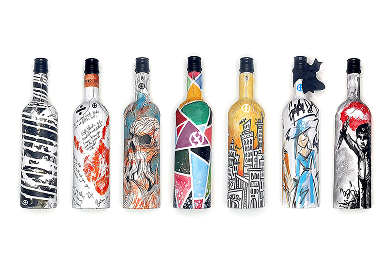
Meanwhile, a new creation called the Frugal Bottle takes the label to a new level.
Instead of the label sitting on a traditional glass bottle, maker Frugalpac has created a recycled cardboard bottle that can be completely printed and fits in with the sustainability focus we keep hearing about.
Malcolm Waugh, CEO of Frugalpac, said: “For Frugalpac the trend is no label – the Frugal Bottle is the label! We integrate the print into the bottle, using all of the bottle to convey the brand, image and information.
“It’s 360 degree communication, as the Frugal Bottle allows you to print all across the bottle. The recycled paperboard can be printed on digitally and then sent to the bottling facility where it’s formed into Frugal Bottles. Since we launched, we’ve been inundated with enquires from bottles, brands and retailers around the world.
“It seems from the feedback we’ve received that the fact you can design all across the bottle is very appealing to the wines and spirits brands.”
According to Malcolm, the bottle “is literally a blank canvas to promote your wine” and its unique look and feel does stand out.
He said: “The Frugal Bottle weighs just 83g so it is up to five times lighter than a normal glass bottle, making it easier to carry and lighter to transport.
“An independent Life Cycle Analysis by Intertek found the Frugal Bottle, which is made from recycled paperboard with no chemicals, has a carbon footprint up to 84% lower than a glass bottle and more than a third less than a bottle made from 100% recycled plastic. The Frugal Bottle’s water footprint is also at least four times lower than glass.
“It’s easy to recycle again. Simply separate the plastic food-grade liner from the paper bottle and put them in your respective recycling bins. Or you can put the whole bottle in your paper recycling bin and the liner will be easily separated in the paper re-pulping process.
“It uses less plastic than a plastic bottle. The Frugal Bottle uses up to 77% less plastic. Only 15g compared to 64g for a bottle made from 100% recycled plastic.”
Tom Boucher Design

When it comes to simple and stunning, Tom Boucher Design has worked with UK vineyards to create labels that work as part of a much wider design ethos for their brand.
We caught up with Tom himself to see what advice he would give vineyards considering how to tackle their next label and what works well in 2020.
“Instagramable labels!” he said. “Considering how your product looks on social media is a good idea in 2020. Having a label that stands out and cuts through aimless scrolling of content is an opportunity to grab attention and draw customers in.
He added that capturing your story as simply as possible is key, and said: “Giving transparency around who made the wine, where it’s from and the processes involved. Use the limited amount of real estate on the label to tell your story and give the customer a sense of what you are all about. Customers across all sectors care more about where their food and drink products come from, your label is an opportunity to showcase this – provenance is key.”
“Customers definitely need to be thinking about sustainability although cost is also a consideration,” he said. “Discerning customers will judge a brand by the decisions it makes on packaging.
“Think about the feel of the paper, the experience as a whole of how the bottle feels in the hand.
“Think about where your product will be seen, too. On the shelf? Think about size, shape and position of label relative to other bottles it will be sitting next to. Really think hard about how your bottle will look in different contexts on the shelf, on social media, in a pub fridge and an online shop.
“Don’t be afraid to do something different to stand out. It’s easy to fall into a comfort zone of creating something that looks like the bottles and branding you are used to and love.”
Tom suggests “bold, contemporary typography that’s breaking away from traditional typefaces used in wine label aesthetics” as an emerging trend in labelling, and his expertise could be what vineyards need to achieve this.
He said: “I aim to help new brands get started, or established brands try something creatively different. I offer everything from brand workshops right through to final packaging design and everything in between.
“I come from a background in startups so I know when budgets are tight you need to be as efficient with design resource as possible whilst still allowing room for creativity. I encourage my clients to create something different and personal to them, something beautiful that captures the imagination as much as what’s in the bottle.
“I take inspiration from the explosion in design creativity that helped craft beer reach the place it is today, rather than worrying about fitting in with a heritage aesthetic that many wine brands fall back on – it’s a great showcase of what great design can do combined with a great product. A brand is more than a label, but capturing eyeballs on the shelf and through social media is an opportunity not to be overlooked. I’m shamelessly the sort of wine drinker that buys a bottle as much for the artwork as for the wine itself and I’m not alone!”