Whether you know it or not, you are slating or applauding the artwork before your eyes.
One of the most exciting things about sitting in a Parisian café and watching the world go by is the amateur sport of people-watching. For some reason, Paris is my favourite place to play this lazy, sometimes cruel and often unexpectedly funny ‘sport’.
Fashion winners and losers stroll by as extroverts and trend-setters adore the fact that we, in the ‘audience’, covertly and sometimes overtly comment on their telegraphed sartorial statements.
It is only fun when you play this game with a friend, so you can debate your thoughts on your quarries, and the wine world has exactly the same sport but it is rarely played out loud or in tandem with a pal.
Label analysis is a brutal pastime. Walk into any wine shop or supermarket aisle and whether you know it or not, you are slating or applauding the artwork before your eyes. Your brain whispers, ‘looks cheap’, ‘what were they thinking’ and ‘I thought we had moved on from critter labels’ as much as it murmurs, ‘I haven’t enough headroom on my credit card’, ‘that’s a Saturday night dinner party wine, not a Tuesday sofa-supper number’ and ‘I can’t see the price, but I know I can’t afford it’.
Labels say so much about a wine – but is what they are telling you accurate? To be honest, I don’t really care what a label looks like if the wine is stunning. Over 30 years ago it was drummed into me that my job was to taste wine, not labels, and yet so many people, even seasoned professionals, seem too often to be won over by slick design, grand names and lofty appellations, ignoring the fact that sometimes the wines inside fall well short.
The ultimate game of wine label-watching happens when you cannot possibly know about a wine’s quality because you have never tasted it before. You see a label and it speaks to you, you open the wine and it sings to you and then you realise that a perfect job has been done in designing an image sprinkled with a few words that accurately sums up the magical flavours in the bottle.
The three wines opposite are all very different, but they do this rare skill with unerring accuracy. See if you agree, and then next time you are shopping allow your wine-watching voice a chance to be heard – it will be fascinating for you to say, out loud, what your brain is cleverly computing behind your eyes.

Adnams
£13.99
www.adnams.co.uk
2018 English Bacchus
Adnams
£13.99
www.adnams.co.uk
First and foremost, Adnams is a business that never ceases to amaze me. I know this company as a wine merchant but, recently, I was asked to write a piece on gin and beer for a Daily Mail Weekend Magazine special and while I expected the beers to impress, a collection of Adnams gins did, too!
Its own label wines are also amazing and this newly released Bacchus is perfect in every way. Coming from the Crouch Valley in Essex, grown (organically, but not yet certified) by award-winning viticulturist Duncan McNeill and made by the rare talent that is Liam Idzikowski, this wine is delicious. I will leave the flavour there because it does the Bacchus dance with excitement and enthusiasm.
The reason for its inclusion in this month’s column is the peerless label design which backs up the flavour, coupled with the wicked price. Everyone should buy this wine in order to see how the price tag, imagery and taste line up perfectly. It is sheer genius, and I will go further. The paper stock is just about good enough (money has not been splurged here) but the artwork is tremendous. It is Bacchus – you can reach into the label, beyond the Robin Hood greens and twisted ivy and feel the beating heart of this English wine. It should win every design award going.

Urban Foxes Winery
£18.50
www.southdownscellars.co.ukThe Urban Foxes Winery.
2018, Pink Pinot
Urban Foxes Winery
£18.50
www.southdownscellars.co.uk
I first met Rebecca Coates when she was wine buyer for Hakkasan, the elite Chinese restaurant group in London. A sophisticated lady with a laser-driven palate (I trust she won’t mind me saying this), Rebecca teamed up with Collette O’Leary (ex-Bluebird Vineyards, now at Henners) after having met each other at Plumpton College back in 2011. They both went on to work a vintage in California and so they are more than globally vinous aware.
I have enjoyed previous releases from UFW and visually, this is a discreet design (they call it ‘rustic luxe’), with nothing boastful or pretentious on the slightly diminutive label. The capsule is budget, the artwork has a home-grown feel, but there is clearly integrity here.
The colour of this wine alone will sell it, but I have expended legions of text in this magazine telling you that colour is no guarantee of flavour. Made from 100% Pinot noir (this is a virtual winery, with fruit sourced from Clayhill Vineyard Estate, Essex), this is a small batch, hand-crafted, 11.5% alcohol rosé, so I am more interested in reading this on the back label than the front one.
On opening, I can forgive the dissolved CO2 which is more than prickly at first, but this fizzles off with a good shake and you are left with a spectacular wine. From the curious name, the downplayed design to the goose-bump-inducing flavour, this is a perfect piece of winemaking meets ocular promise.
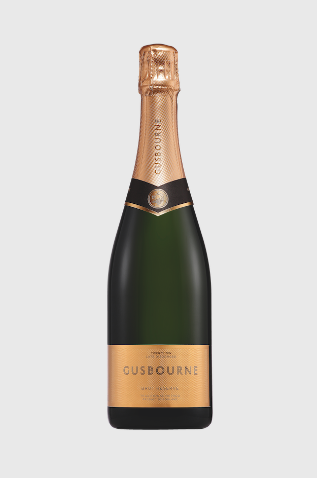
2010 Late Disgorged Brut Reserve
Gusbourne
£99.00
The Nest, Gusbourne’s cellar door only
There is a horrible hurdle to contend with when your labels and branding are all neatly organised, smartly liveried and sounding the trumpet with clarity and accuracy. This seemingly impassable barrier looms when you plan to release an elite cuvée.
It is the stuff of nightmares, cold sweats, and confusion. Arguments, cost implications, stuck stock, loss of face, undoing of all of the hard work you have already undertaken and gnashing of teeth ensues, unless, of course, you get it right.
Gusbourne’s labels are very smart indeed and the wines all stack up. But how on earth do you present a late disgorged, top end wine such that it looks the part and that the flavour is both respected and represented in visual form.
The answer is you do something that the French and Spanish seem to do with appalling results, but you do it right. Adding gold to a label sends a shiver down my spine. A metal coloured capsule is de rigeur, but the thought of a gold label gives me a queasy feeling I cannot shake off.
Thank goodness then that Gusbourne chooses a textured, filigree-feel, herringbone-patterned, old gold paper which is drop dead gorgeous. It is reminiscent of the flavour that this nine-year-old, 68% Chardonnay, 22% Pinot noir, 10% Pinot meunier blend brings on its superb palate. It is brave and I love the way that the design is elegant, noble and reassuringly luxurious – just like the wine.