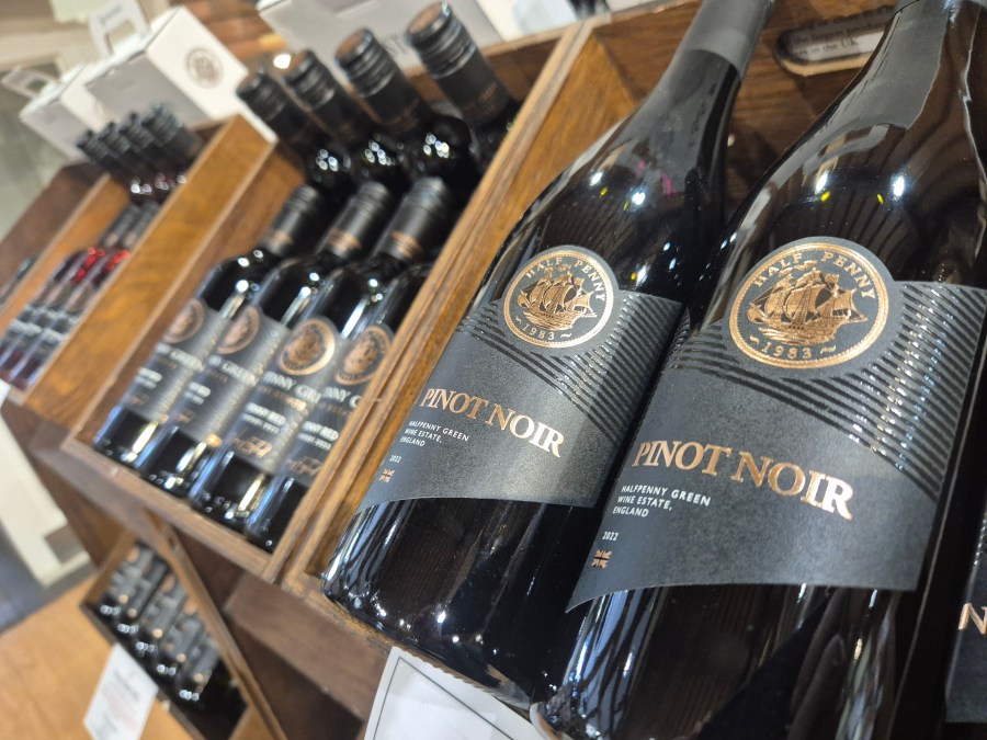
Halfpenny Green Wine Estate is raising a glass to a fresh new look to complement its award-winning bottles of wine, after revealing a stylish upgrade of its label designs.
The estate’s iconic branding has been given a subtle yet sophisticated refresh, maintaining the classic look customers know and love, while introducing stylish new touches that reflect the craftsmanship inside each bottle.
The new labels, originally designed and now upgraded by The Studio in Tettenhall, blend tradition with a contemporary twist and are created to help Halfpenny Green’s bottles stand out proudly on shelves, tables, and wine racks alike. Halfpenny’s signature coin has been made more prominent, with the same elegant look and feel remaining.
Halfpenny Green Wine Estate owner Clive Vickers said: “We’re incredibly proud of the wines we produce, and we felt it was time for the labels to reflect that same level of care and attention. This isn’t a radical redesign, but more of a subtle evolution. We’ve kept the essence of our branding, but refined the details to better express the quality and character of what’s inside the bottle.
“It’s about making a great first impression, which we know really matters. We hope our customers love the new look as much as we do.”
The updated labels are now rolling out across the full range, and visitors to the estate are invited to take a closer look and share their thoughts during tastings and tours.

For more like this, sign up for the FREE Vineyard newsletter here and receive all the latest viticulture news, reviews and insight